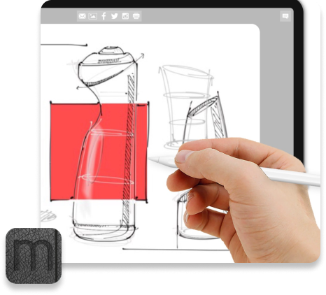
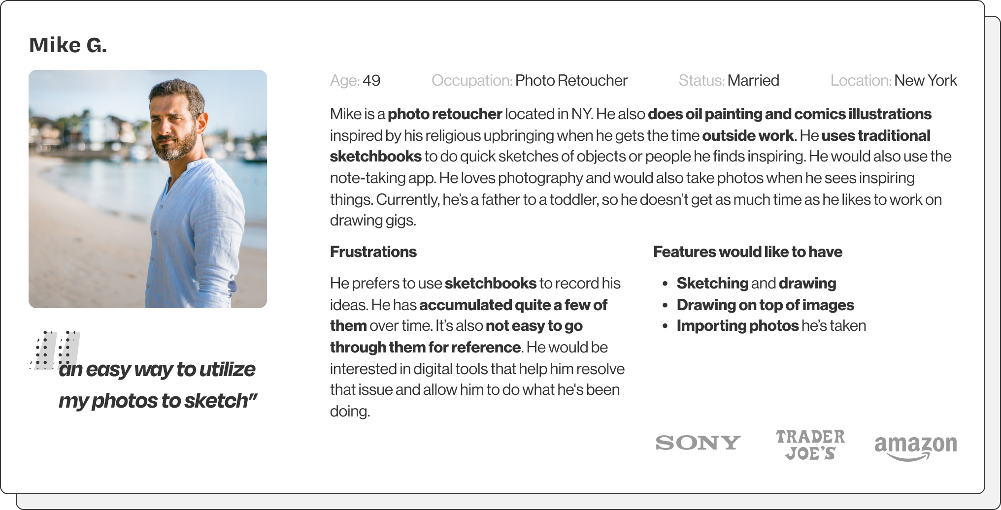
CapMo is short for ‘capture the moment.’ It will be an app that serves as a digital repository for ideas and inspirations. It allows users to capture and organize their thoughts, ideas, and things they found inspiring to create a library of their own creative journals with easy access between different devices.
UI/UX Designer
Researcher
Figma
Feb–May 2022
mobile & tablet app
Creative people like to get inspired. However, it is quite often that not have access to capture the exciting ideas, images, or inspirational conversations at the moment. When they do, the materials are scattered around and forgotten. If they record them (like in sketchbooks), keeping stacks of physical sketchbooks creates clutter.
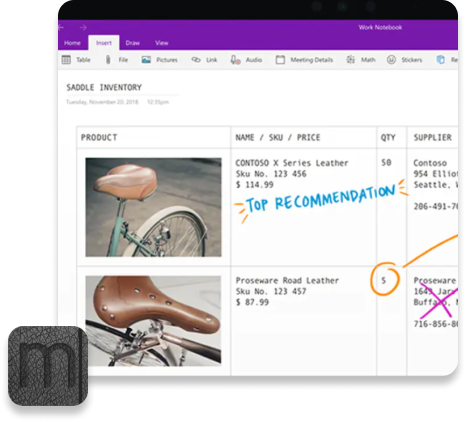
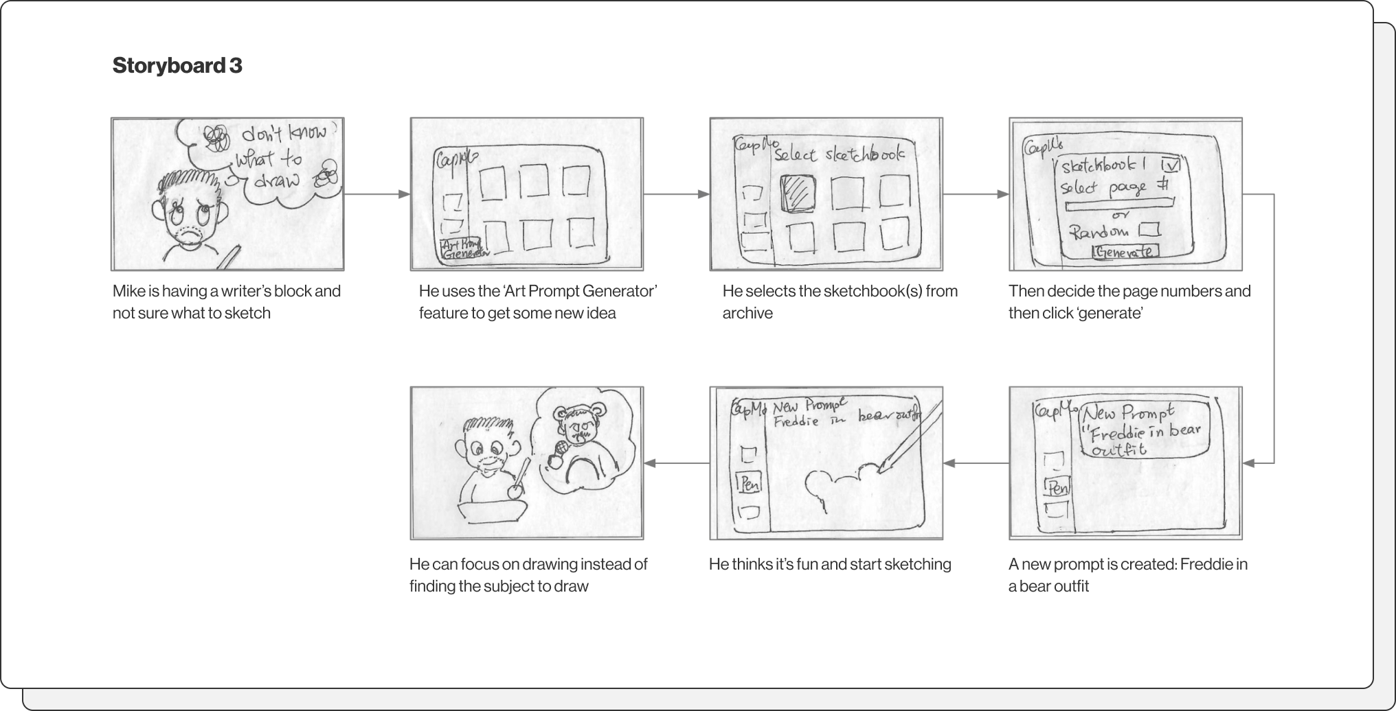
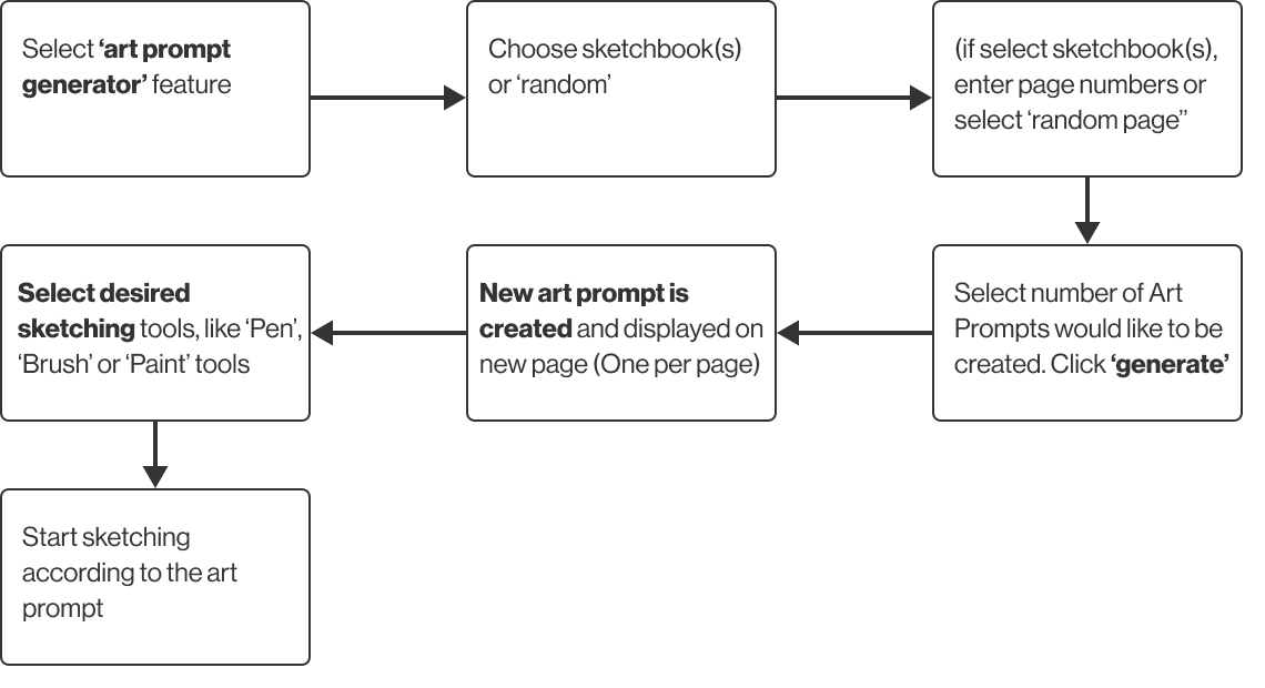
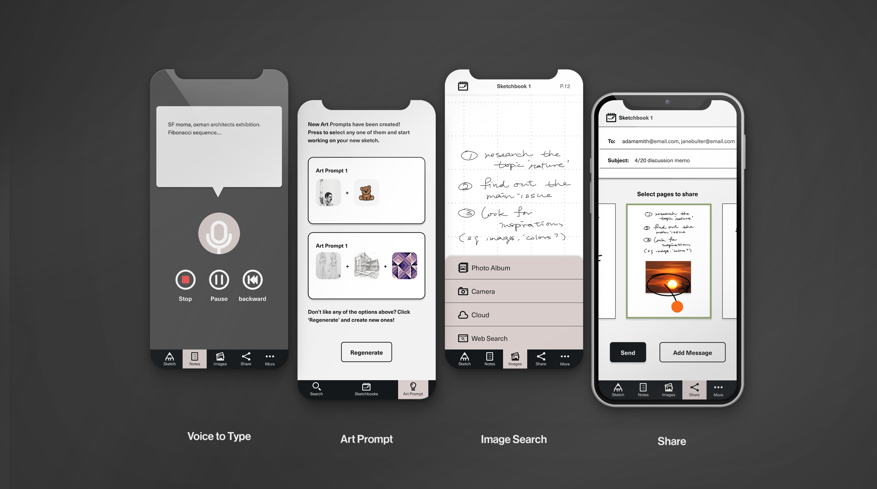
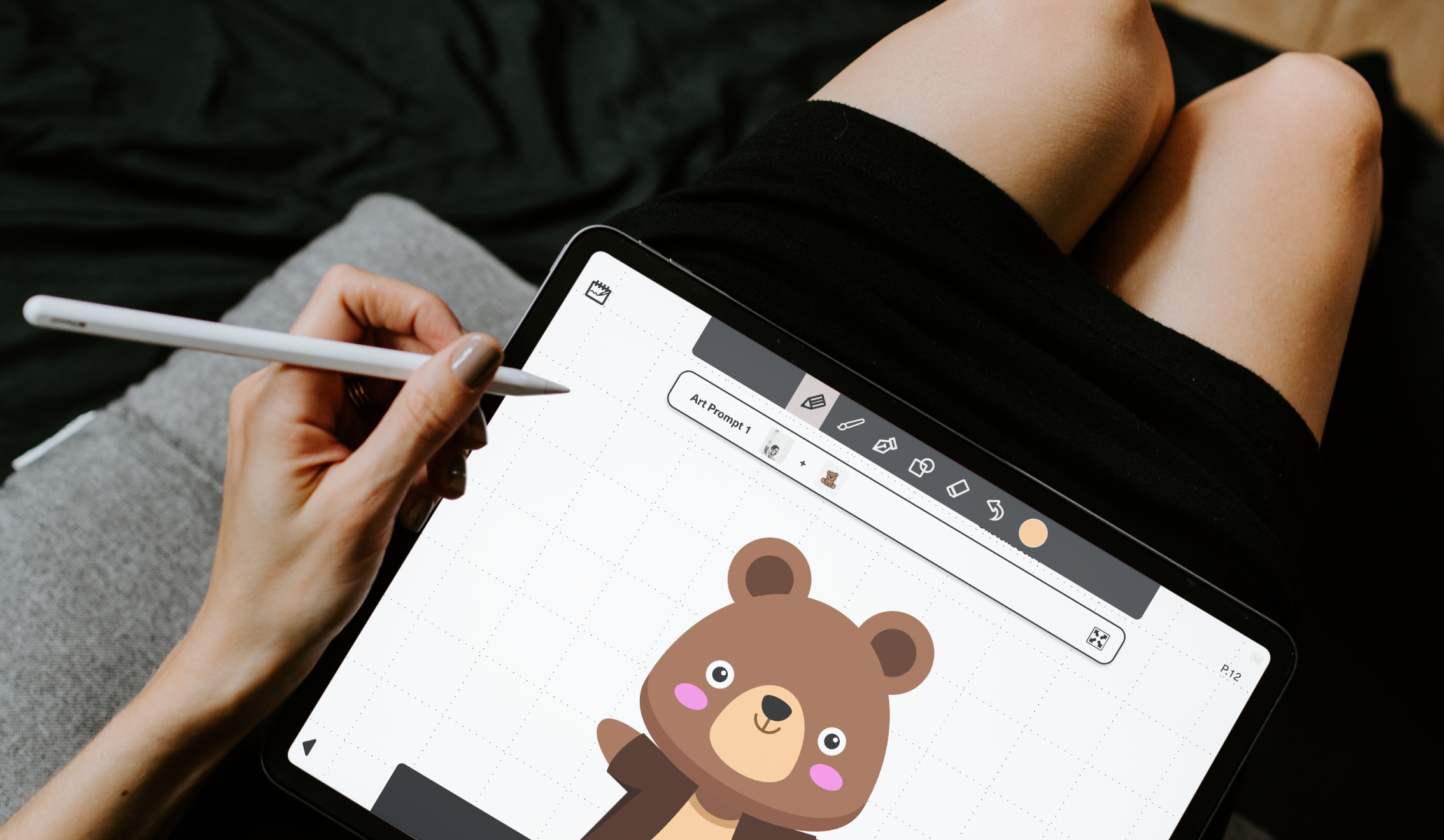
A personal digital creativity repository allows users to collect, manage and share their thoughts and inspirations. It also helps boost new ideas with the art prompt generator feature. Users also have access to the content on different platforms.
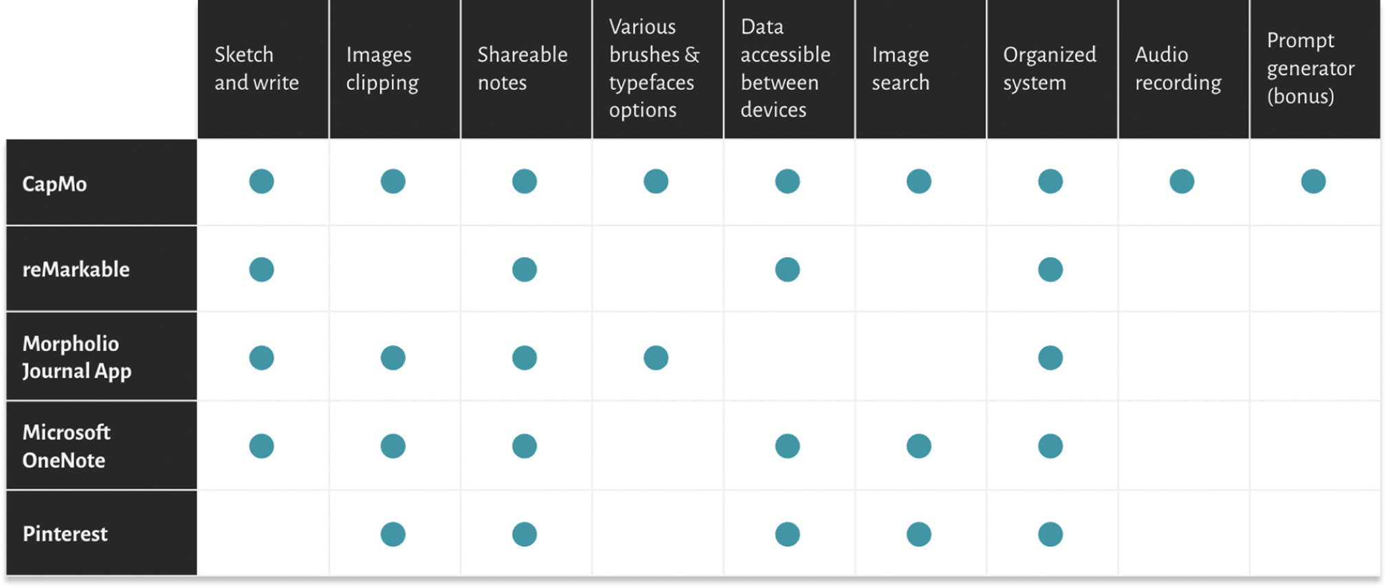
Pro:
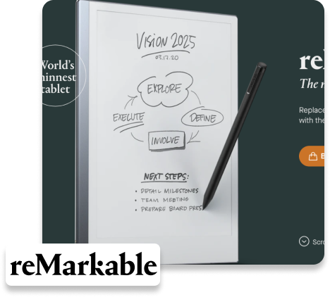
• Paper-like writing, sketching, and reading
• Data accessible on all devices (mobile, tablet, laptop and etc)
• Note writing on pdf directly and able to export pdf file
Con:
• only black and white UI
• No drag and clip images feature
Pro:
• Dynamic writing and sketching
• Many options of brushes and colors
• Incorporates images for notes and sketches
• Provides different grids background to work on
Con:
• App only available on mobile and tablets
• Data don’t share between different devices
Pro:
• Incorporates images for notes
• Able to share notes/pdf to other
• Data accessible between different devices
• Direct search and import images from the internet
Con:
• Very limited brush textures options
• Type feature is only for note taking
I did market research to find out who the competitors were and their pros and cons.
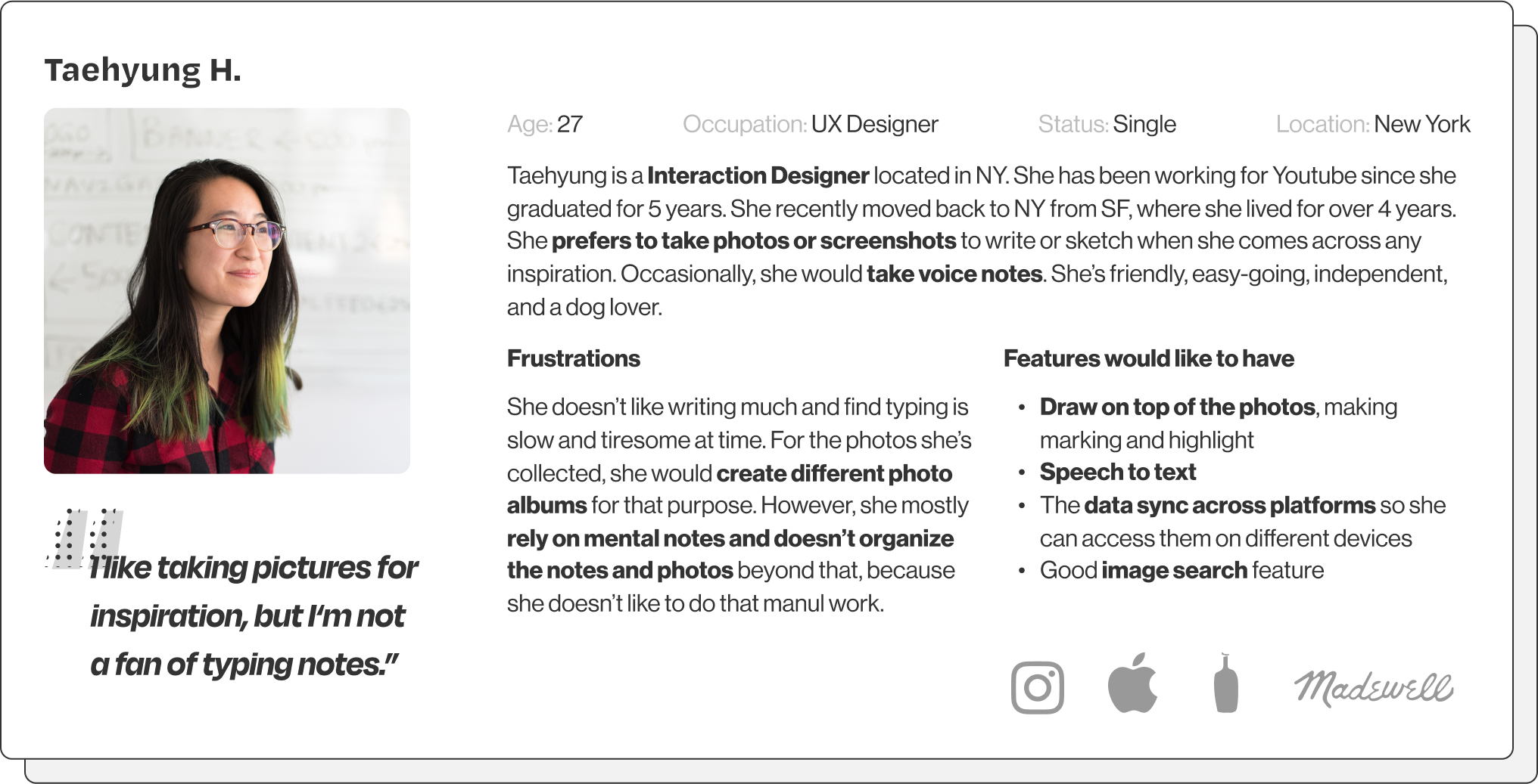
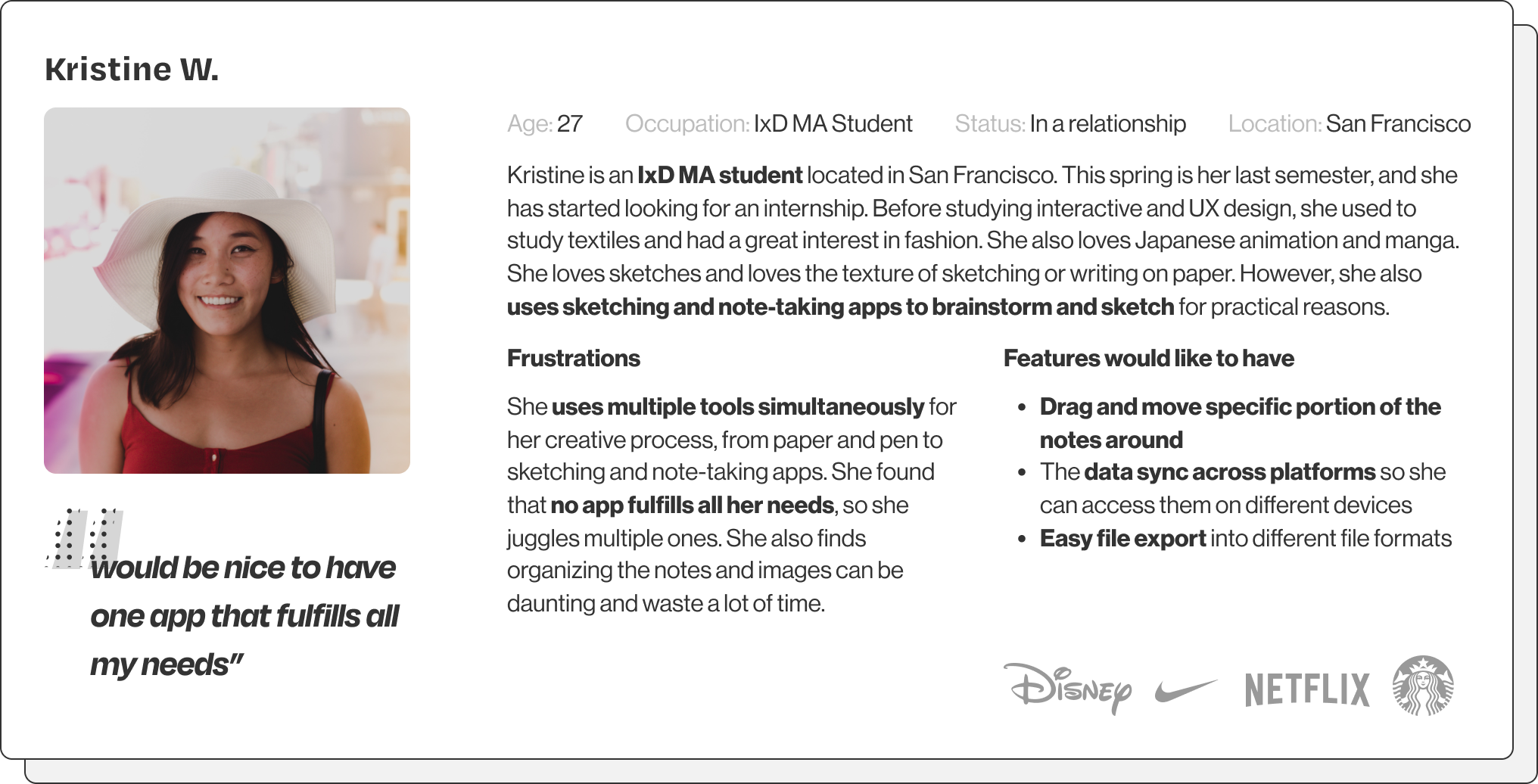
I conducted both surveys (30 respondents) and 5 interviews in the initial stage to understand my target audiences better and their thoughts and needs for my project. All of them are either studying or working in the creative field.
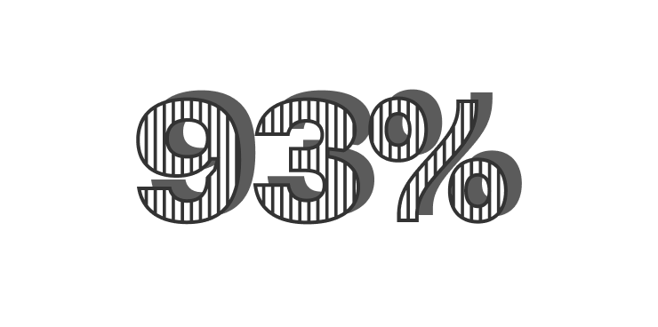
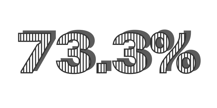
believe keeping a visual journal helps their creating process
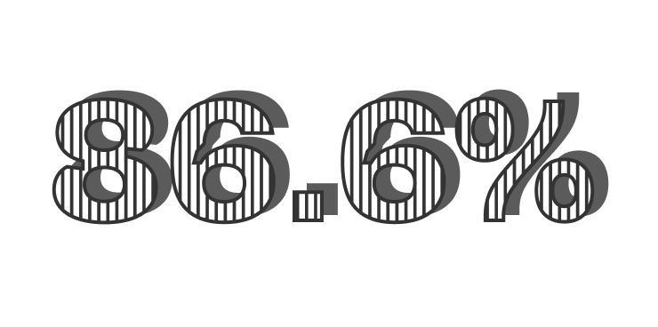
keep a design journal in any form for your ideas, thoughts and inspiration
had associate degree or higher
• creative professional
• age 18-45
• college-educated
• who work or study in the fields such as graphic design, UX/UI, architecture, interior design, etc.
• like to keep visual diary, create mood boards and draw inspirations from surroundings to help their creating process.
• non creative professional
• age 18+
• high school educated or above
• who doesn’t work in creative field but likes to do artistic activities in the spare time
• like to collect different visual inspirations for personal projects, such as home renovation
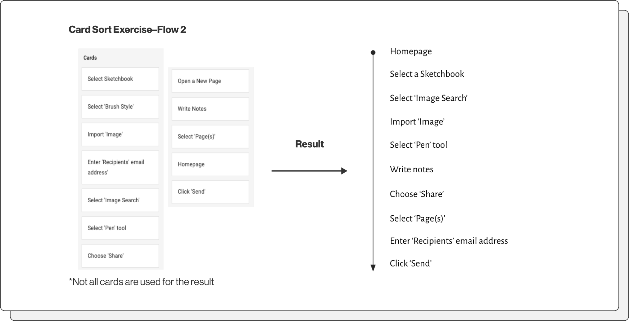
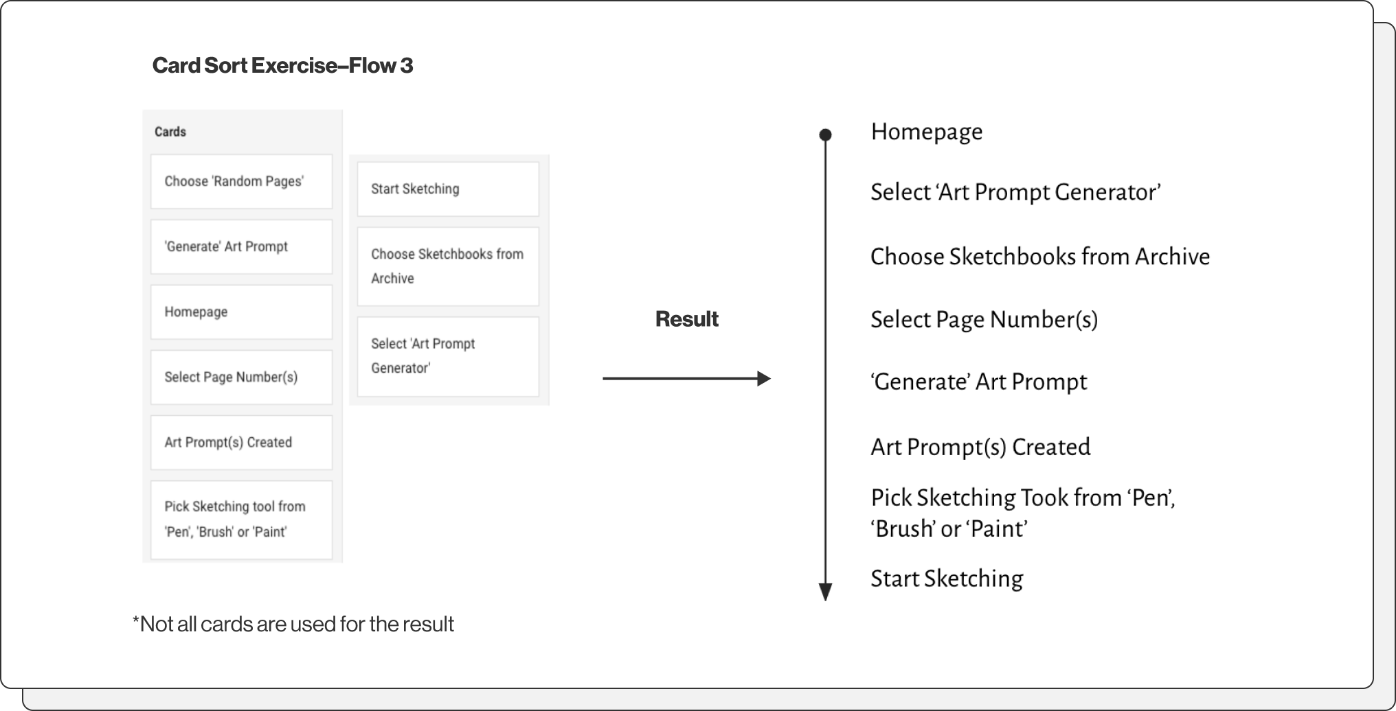
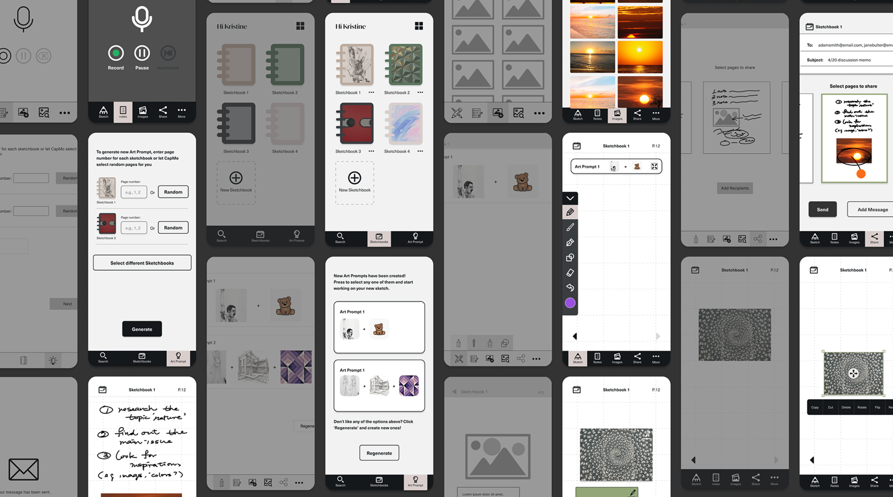
Before I started creating the wireframe, I used the card sort exercise and storyboards to understand the users' preferences, values, and how they might interact with the app.
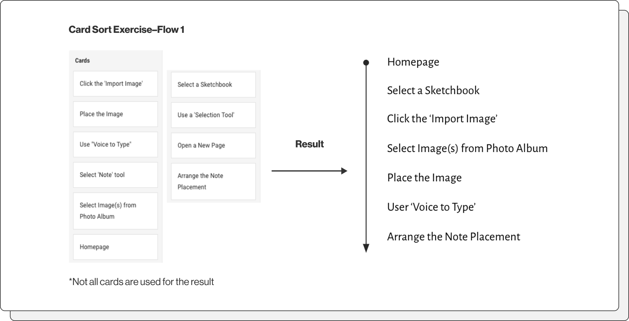
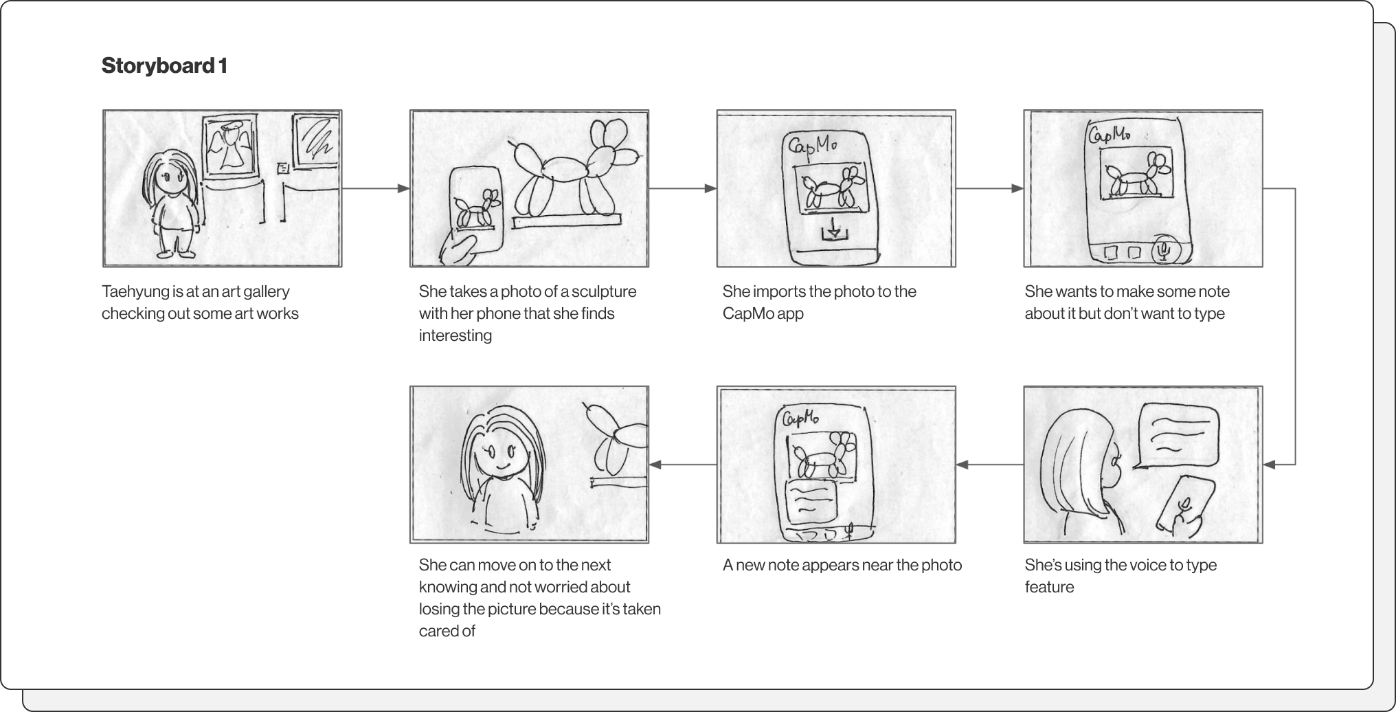

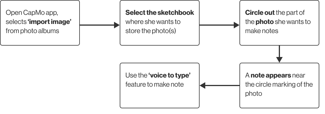
Task 1: User takes photos of a painting and wants to make some marking and notes about it.

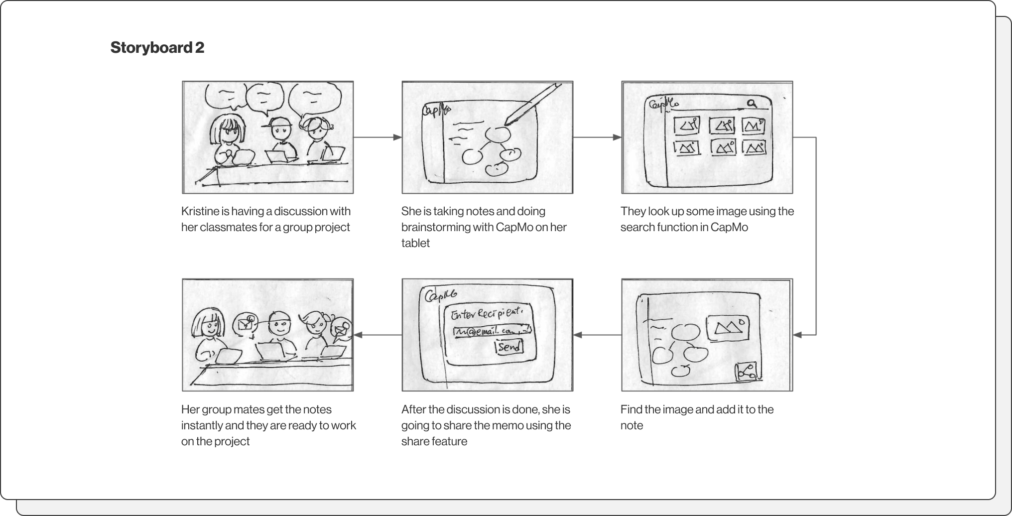
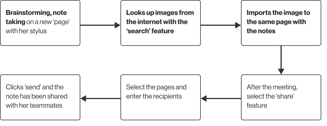
Task 2: User would like to share notes with images from the meeting to her teammates with ease.

Task 3: User would like a easier transferring process from his sketchbook to his desktop, also reduce the clutter.
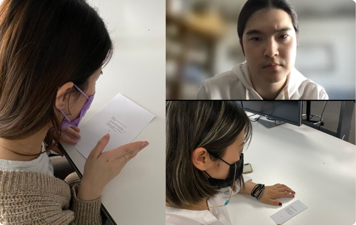
I then created the paper prototype and conducted the first user testing. I also did 3 round of iterations based on the feedbacks.
I went through a few rounds of iterations and made changes according to the result of the user testing. Here are a couple of examples of the changes.
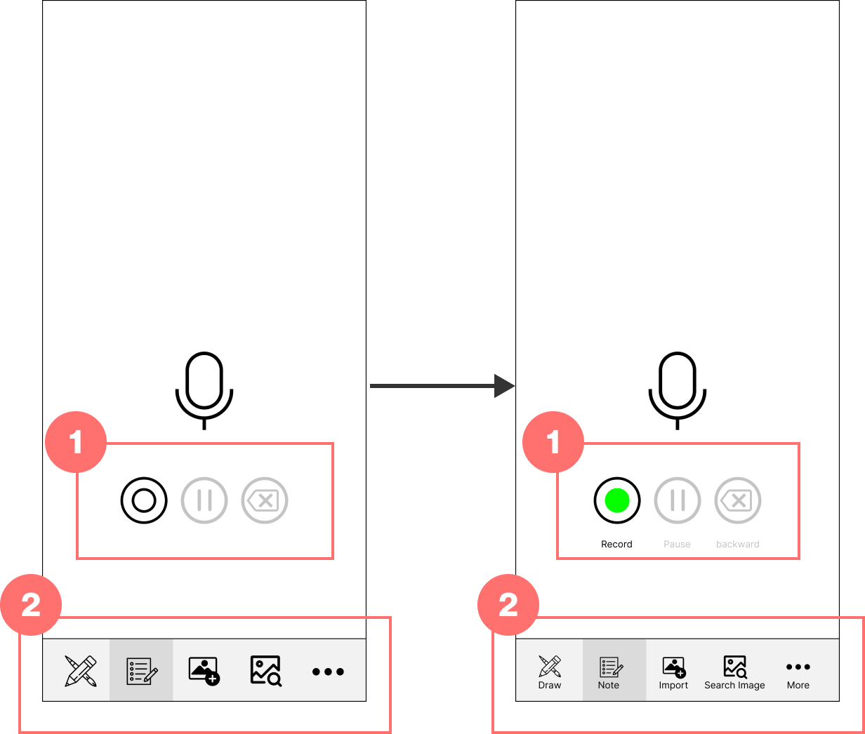
Before
Icon only for both the record functions and the navbar
Feedback
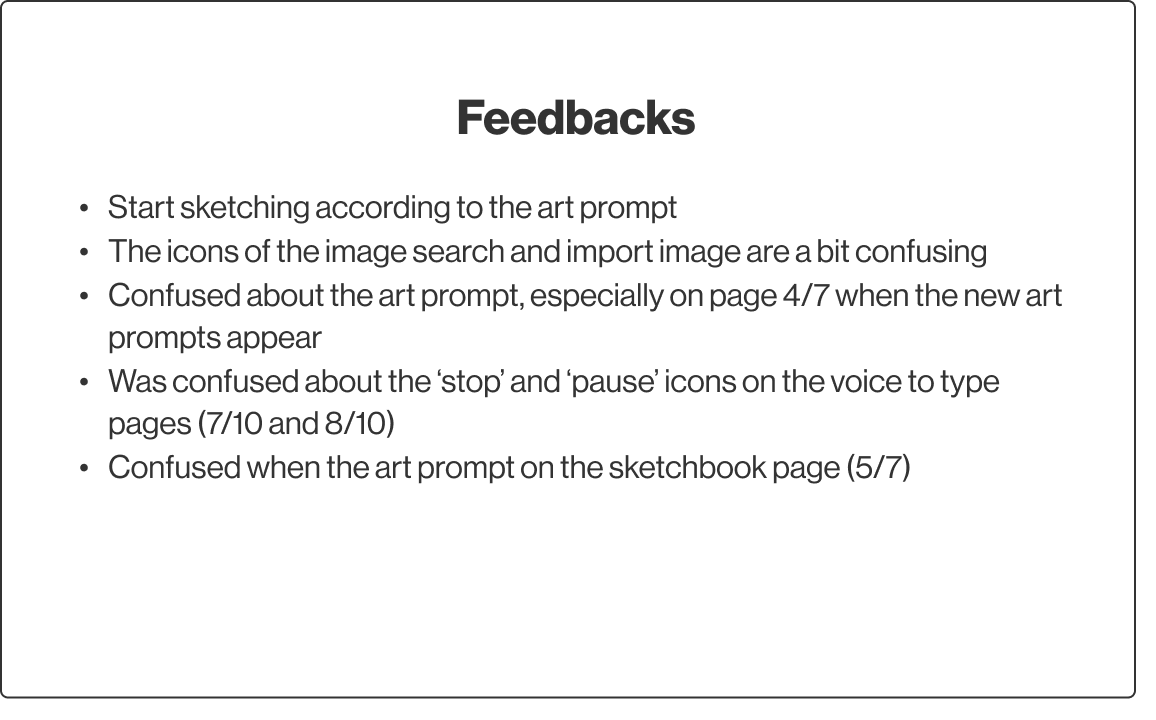
1. Testers found the icons for the record feature a bit confusing, especially the recording or pause feature.
2. They were confused between the import and the image search icon on the navbar.
After
Add text labels below the icons button for both the navbar and the record features to have a better indicator of the function
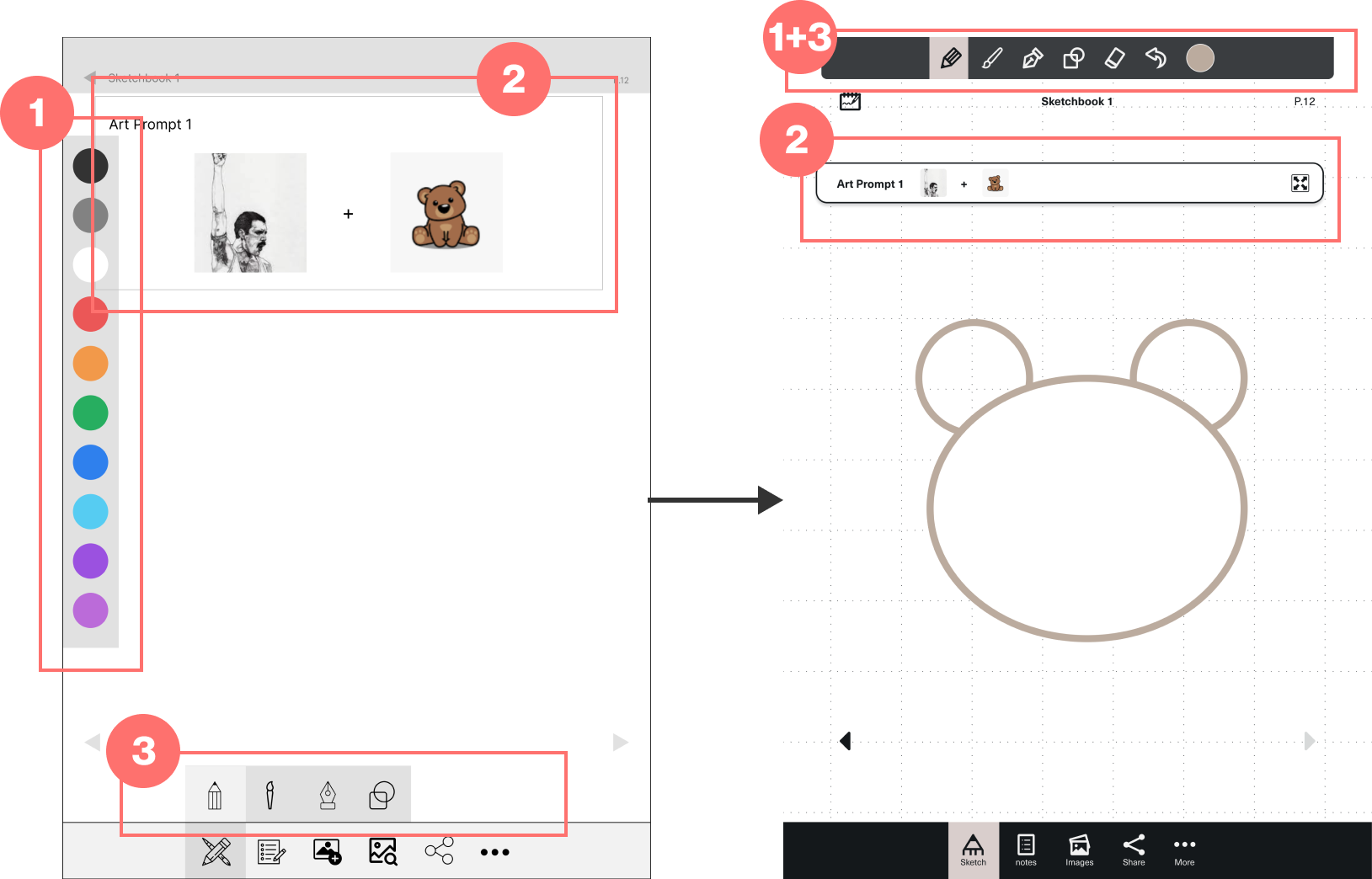
Before
1. Color palette panel and sketching tool panel are separated
2. The art prompt took up a considerable real estate of the screen
Feedback
1. Testers found the icons for the record feature a bit confusing, especially the recording or pause feature.
2. They were confused between the import and the image search icon on the navbar.
After
Place the sketching tool bar on top of the screen (including different brushes, eraser, color and more)
Assumption
During the design process, I learnt that my assumption is not always right, despite that I’m supposed to be very familiar with the target audience–the creative crowd.
Research & Testing
This project allows me to dive deeper during the research process. I was able to do multiple rounds of Interviews and user testings to find out a better solution.
Taking Feedbacks
I found that gaining feedbacks at different stages is very important for me during the design process for this project.