FinEd is a learning app that helps users study personal basic financial knowledge and terminology beyond budgeting and saving. It tries to organize complex information into a more accessible form to learn. Help users better understand the concepts of relevant finance terms and concepts.
UI/UX Designer
Researcher
Illustrator
Figma
Adobe CC
Sept–Dec 2021
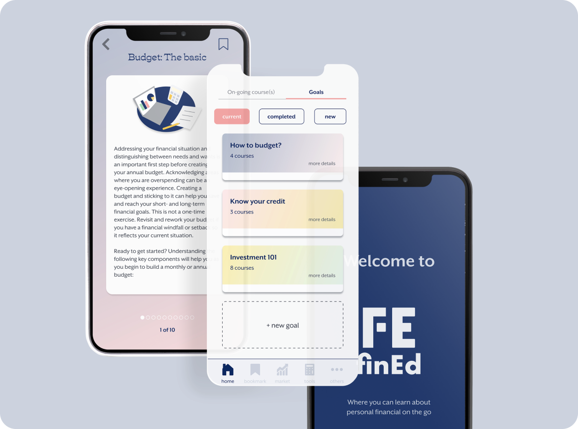
mobile app
On top of being financially responsible, budgeting, not carrying credit card debt, and saving up. It can be quite intimidating and confusing about all those investment tools and doing any financial planning. And wonder what’s the next step?
A personal digital creativity repository allows users to collect, manage and share their thoughts and inspirations. It also helps boost new ideas with the art prompt generator feature. Users also have access to the content on different platforms.

I created a questionnaire to reach more people to get a better picture of their attitude and approach regarding getting themselves more educated about personal finance. In total, 17 participants, aged between 18-55 yr old, 16 of them are college educated.

agreed that acquiring financial literacy will help to achieve their financial goals

of them never took personal financial courses

of the participants do some form of investments
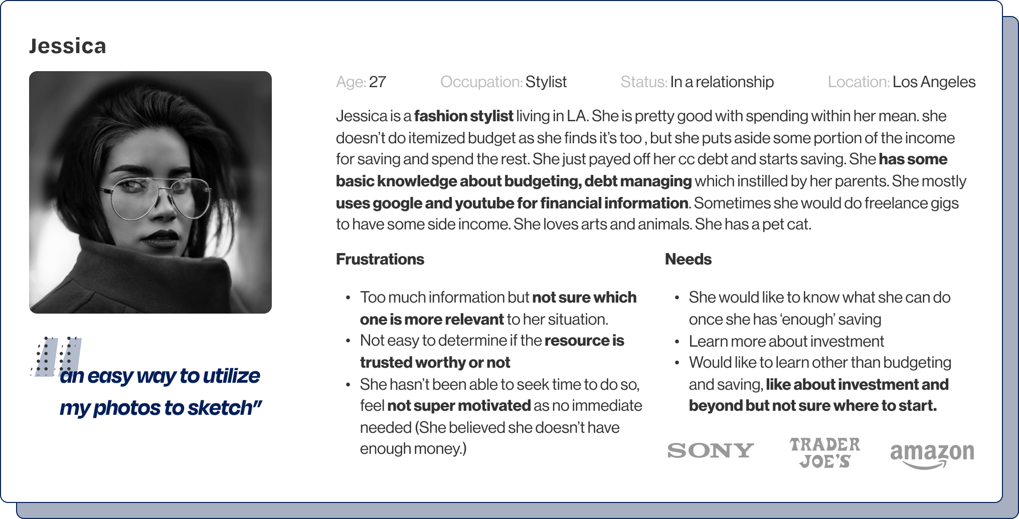
I’d conducted 5 interviews, and my participants are between 25-32 years old. They all had at least some college education, and 4 out of 5 have grad school education. I noticed in common that they all seek financial advice and information from family, friends, and co-workers first. They all use the internet to search the financial knowledge: google and youtube.
Most of them have not heard of the term ‘Financial literacy’ except one. But in general, they are doing pretty good with basic budgeting and debt management. Their parents played a big part in instilling them about the importance of saving. Most of them are aware that investment should be the next step after saving, but most feel like there's a barrier like neither have enough money or knowing enough to take action or both.
Despite having some knowledge from the research, they feel like they don't know enough. They feel like going more in-depth is very time-consuming and uncertain what information would be the most relevant. Hence not motivated or not willing to take the risk without the knowledge to take further action.

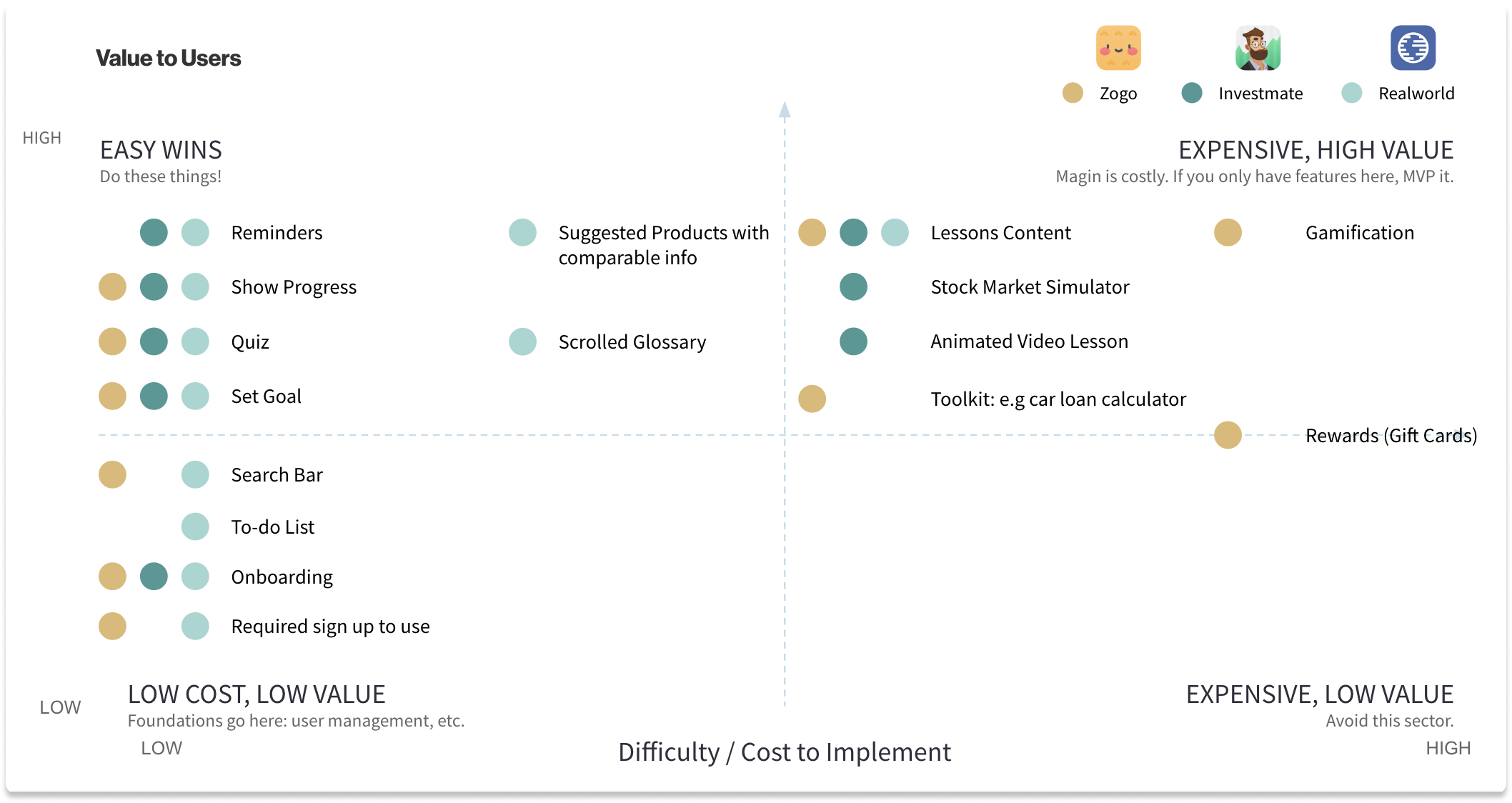
I compared the following financial learning app available in the market, Zogo, Investmate, and Realworld. Investmate is a learning app about investment for both beginner and experienced users. Zogo targeted younger users to learn about the basics of personal finance using gamification. Realworld’s primary target audiences are young adults. It covers subjects like personal finance and other aspects of life like job searching, renting, and more.
After the brainstorming session, I decided to work on the user flows that would help users get started and encourage them to stay on the courses without feeling overwhelmed and intimated by the topic's complex nature.
Goal: To get started and taking the first course.
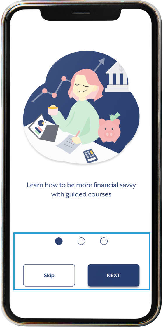
1. Onboarding
2. Questions
3. Goal list
4. Individual Goal
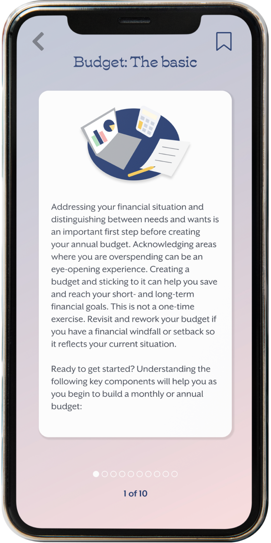
5. Individual Course
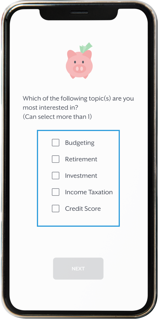
1. Onboarding: a brief introduction of the app, user can skip it and go straight to the questions
2. Questionnaire: select relevant answers (can check more than one) that help to create a customized goal list
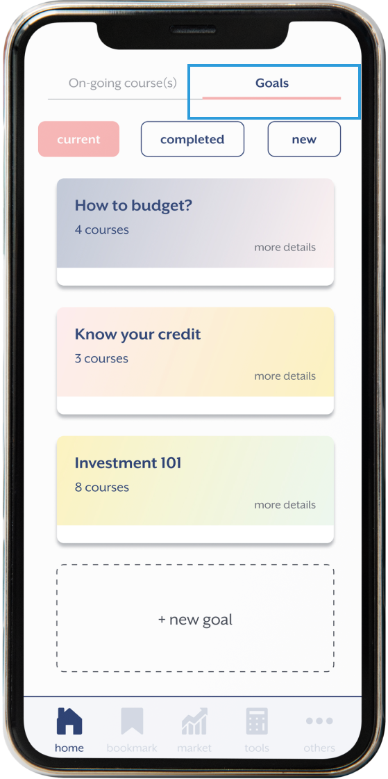
3. Goal List: a list of recommended goals generated based on the answer from the previous questionnaire
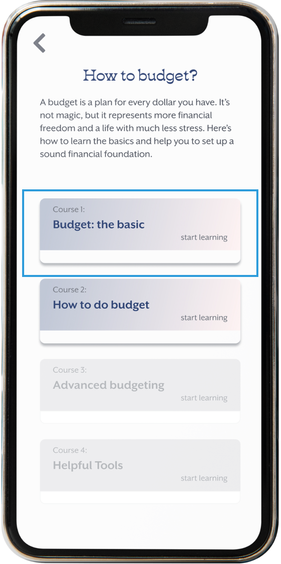
4. Individual Goal: click into individual goal to read the overview of each goal
5. Individual Course: select the goal and start taking course. Progress will be shown on the overview
Goal: To add a section of the course to favorite for later revision
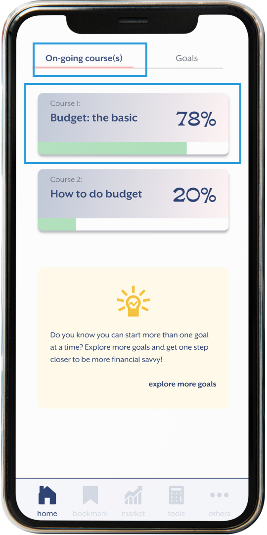
1. On-going course : select a course to continue
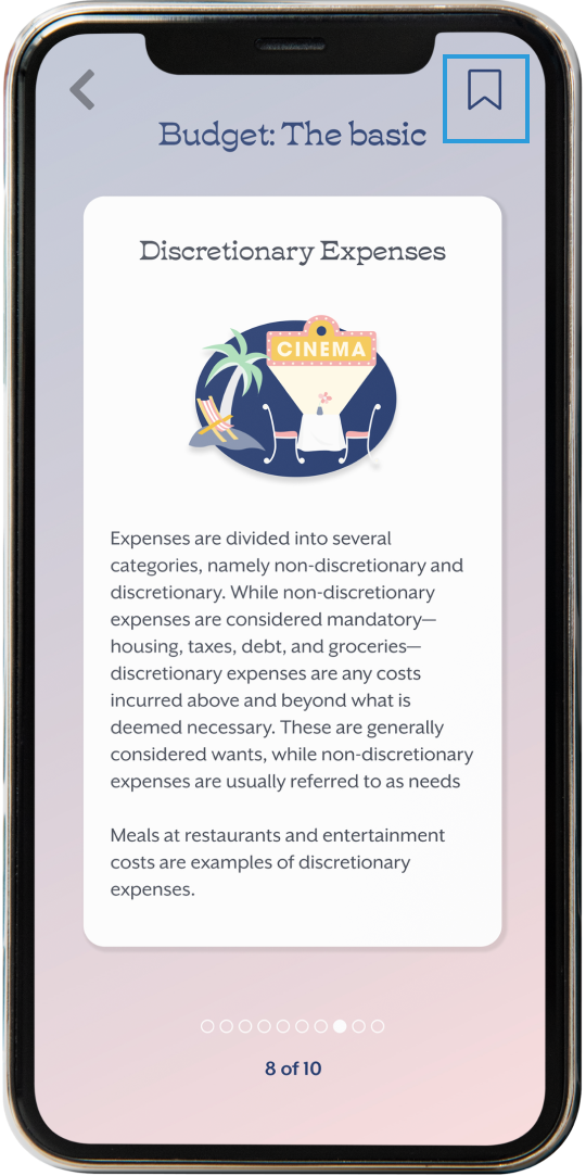
2. Individual Course: want to bookmark this particular section for later revision, tap on the bookmark icon on the top right corner
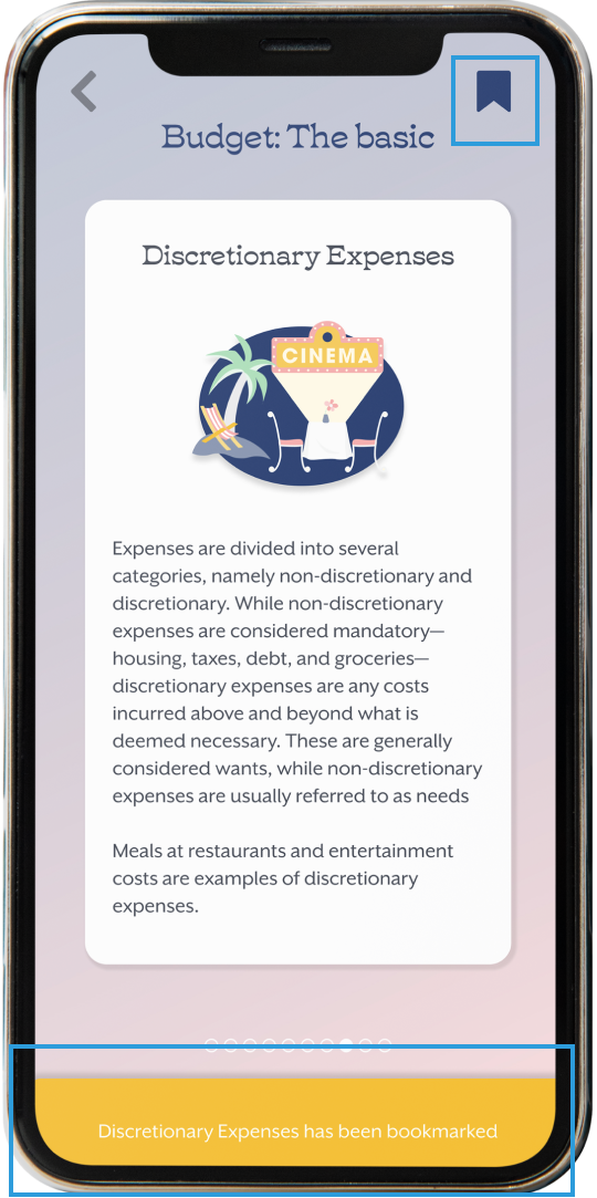
3. bookmarked: the filled bookmark icon indicates this page is added to ‘Bookmarks’, a toast slides up to confirm
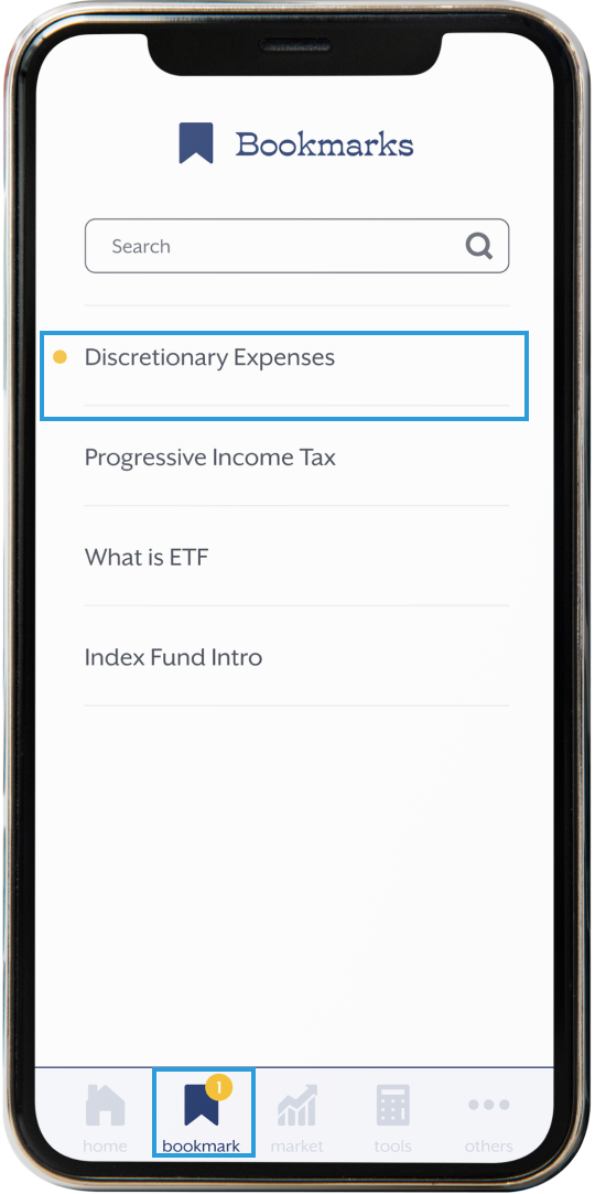
4. Bookmarks: a new notification on the nav appears(yellow dot), indicates recently added item
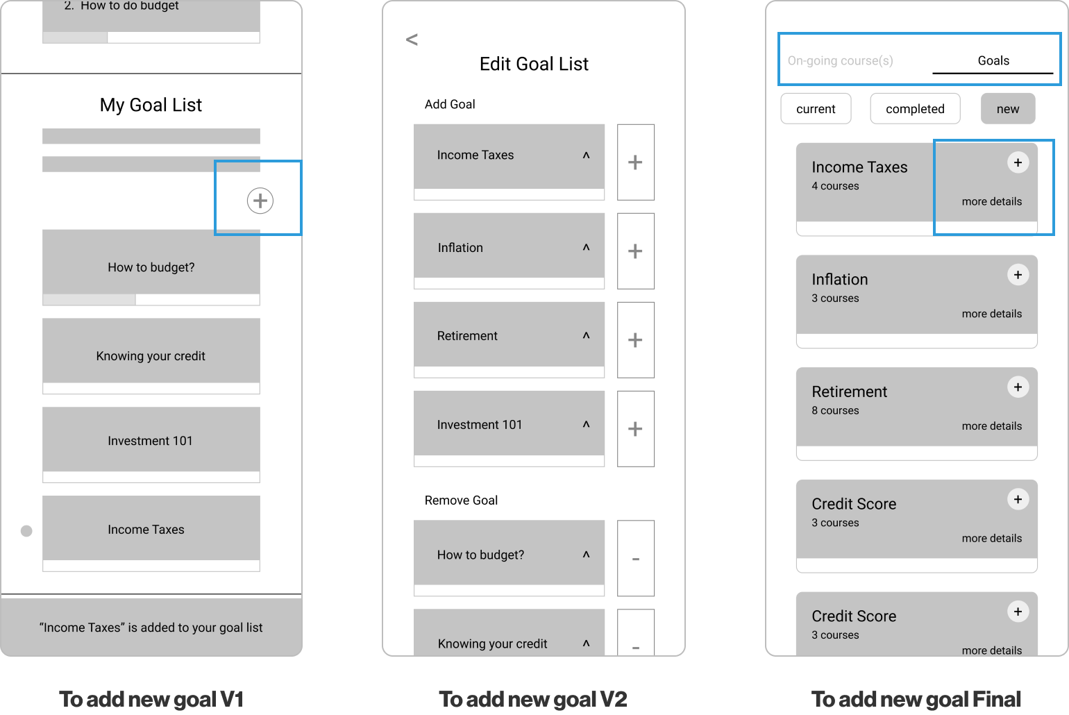
Goal: To add a new goal to the existing goal list
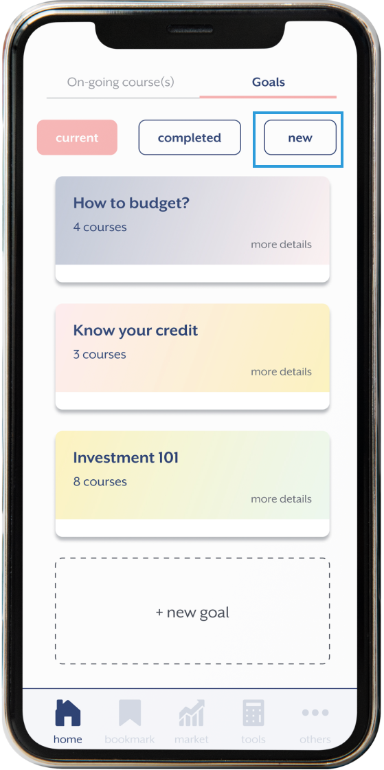
1. Goals : on ‘current’ page which lists the goals already added, select ‘new’ to look for new ‘goals’
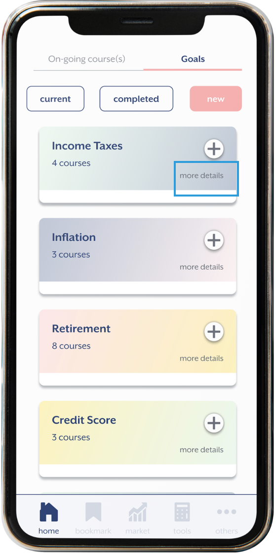
2. ‘new’ goals page: it shows a lot of the new goals that is not on the ‘current’ list, tap ‘more details’ to see the summary of the goal
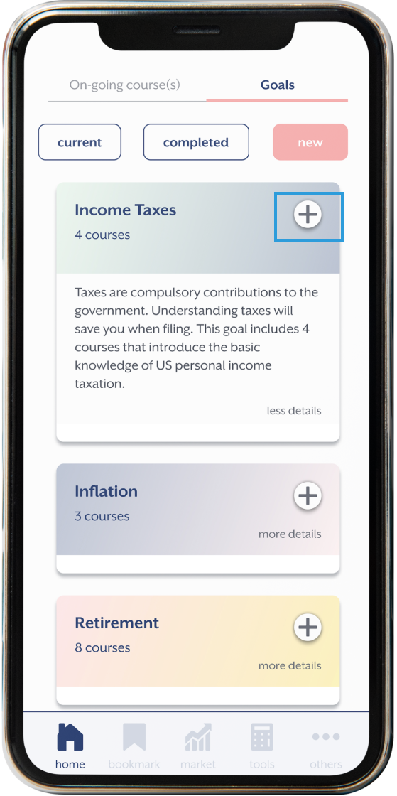
3. expanded goal summary: after reviewing the overview of the new goal, tap the ‘+’ button
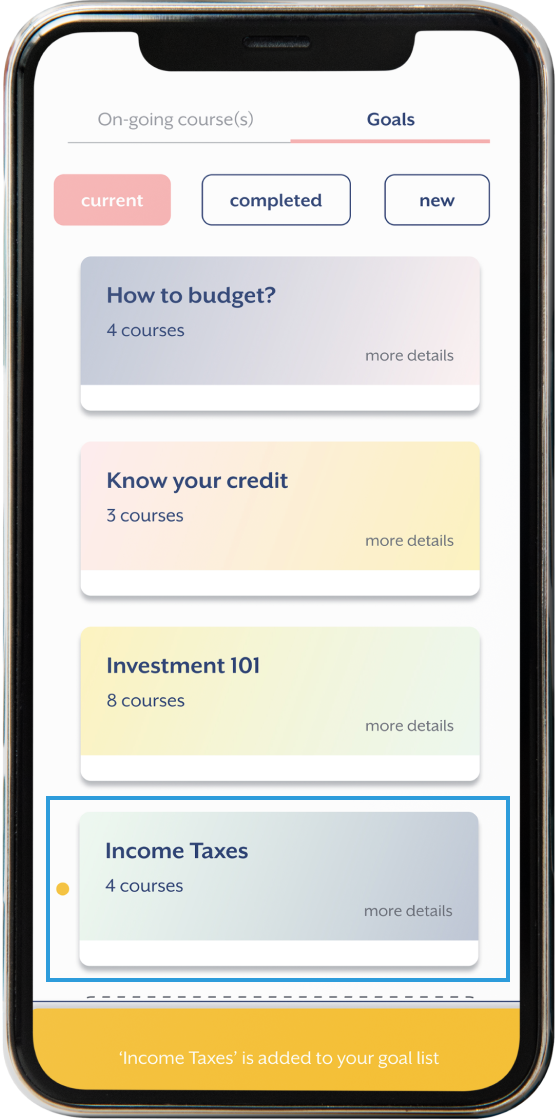
4. New goal added: new goal shows up on the ‘current’ list
I created some lo-fi prototypes for testing and conducted 2 rounds of testing virtually with four participants that were part of my target audience.
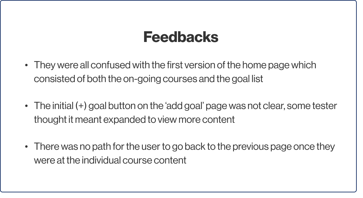

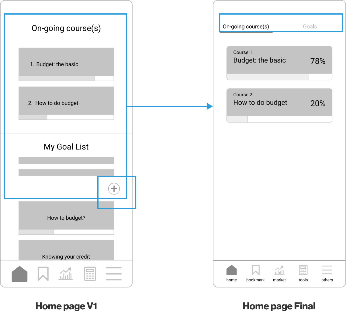
In the first version, ‘ongoing course’ and ‘my goal list’ are stacked on top of each other. After the user testing, I noticed ‘my goal list’ would get pushed down and disappear from the homepage if users took a few more courses concurrently. To solve that issue, I separated them into 2 tabs. Users could access either from the homepage without having to scroll down much.
I also noticed the ‘add(+)’ button below the ‘My Goal List’ got overlooked by some participants during the tests.
With version 1, user would need to access a separate page (edit goal list) via the ‘add(+)’ button from the homepage (below my goal list) to ‘edit goal list’. Some testers were confused about the ‘add(+)’ button next to each goal and thought it meant expanding the content. I added a collapsible icon for the 2nd version to ease the confusion.
After the last round of testing, I removed the 'add(+)' button below the 'my goal list' and the stand-alone 'edit goal list' page. I updated the homepage layout that users can view and add new goals from the ‘new’ goals page without the need to go to a separate page. I replaced the collapsible icon with the text ‘more details’ to add clarification.
If I was given more time for this project, I would like to continue to make improvement for the app. There are a few areas I would like to explore and design, such as
• create a full sitemap
• develop the features that already listed in the navigation bar: simulated market, tools & tips and etc
• New task flows based on the new features
• Create some prototype transition animations